COLOR TOUR: A Saul Zaik Designed Home in Portland’s Southwest Hills
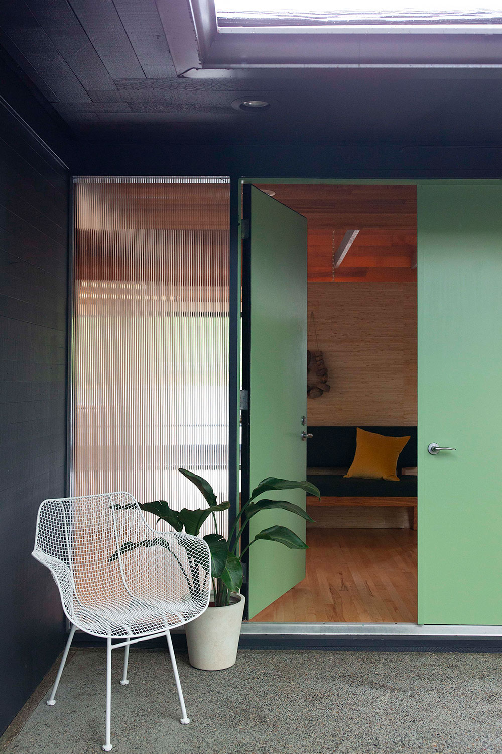

Venetian Glass | H0079

Midnight Magic | 0508
This special mid century home was designed by architect Saul Zaik. It was recently on the market, represented by Gabrielle Enfield of Living Room Realty. For an exterior refresh of the 1965 home, the sellers consulted with Miller Paint to help find colors that felt current, yet honored the home’s history. For the front doors, they chose Venetian Glass | H0079, from Miller Paint’s Historic Collection – an unexpected, fresh green. For the body color they chose Midnight Magic | 0508 – a black with navy undertones.
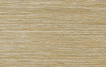
CAPE MAY WEAVE, Grasscloth, Thibaut
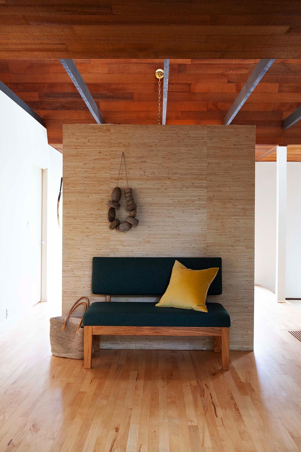
The entry area of the home is defined by a grasscloth wallpapered divider that separates the dining room from the foyer. Similar styles of wallpaper are available at Miller Paint’s flagship store in Portland’s Central Eastside Design District.
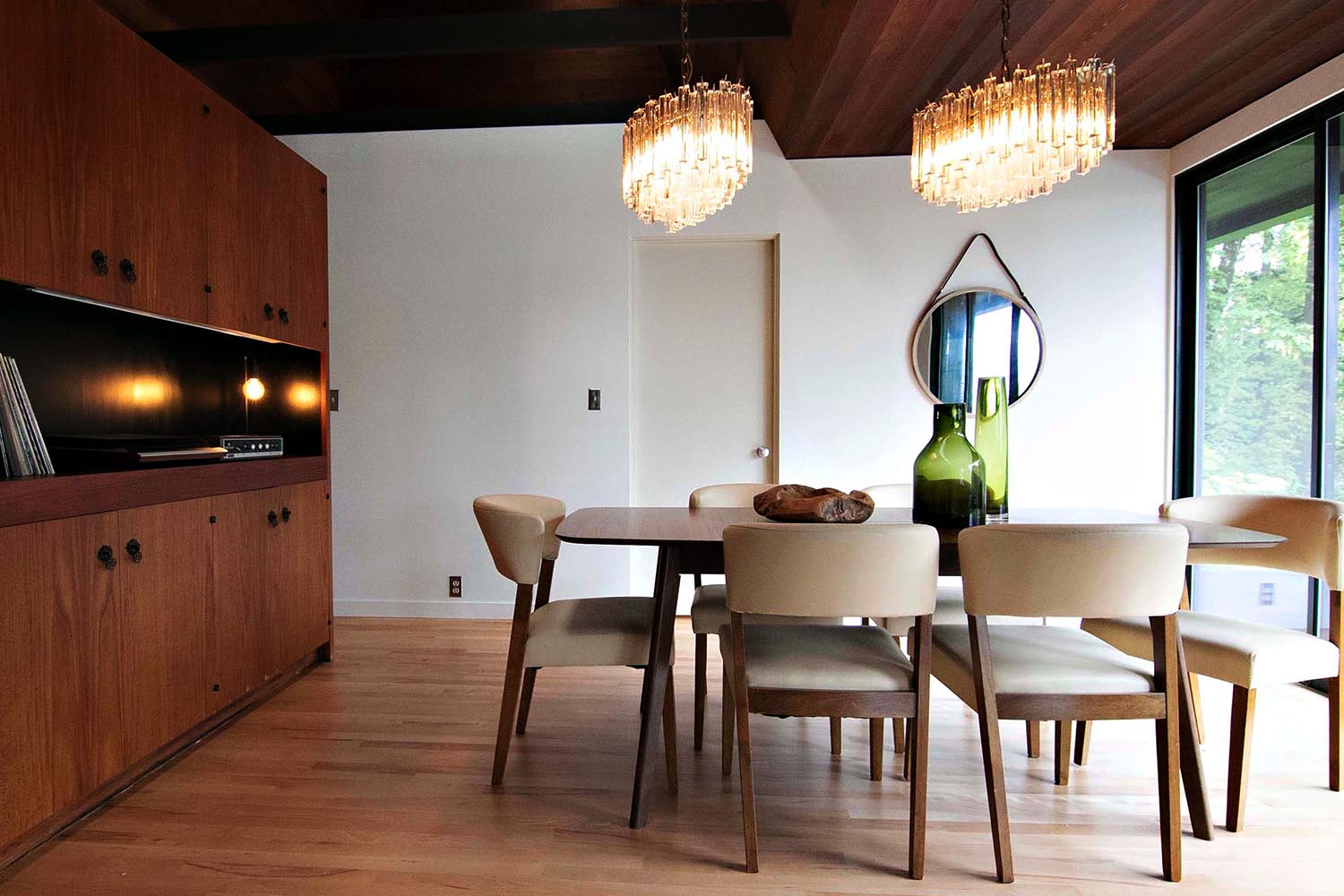

Delicious | 0438
Walk around the entry wall to the dining area where built-in cabinets are designed for easy entertaining. Sugar Dust | 0011 walls complement the many wood surfaces and maximize natural light in the space. A hint of earthy green found in the glass bottles activates this color palette and invites the outside in. Our favorite olive green paint color is Delicious | 0438.
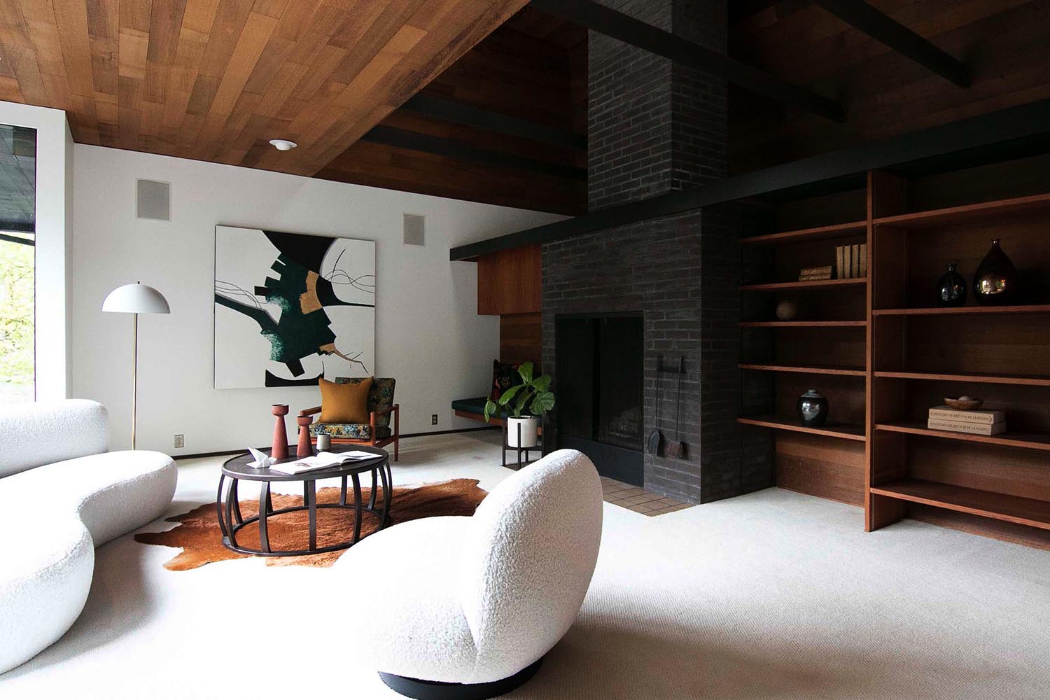

Sugar Dust | 0011
Two steps down from the dining area is the stunning living room, the home’s main public space. The contrast of black brick, rich woods and Sugar Dust | 0011 is clean and modern, and suits the mid century aesthetic. Impeccable staging by Polka Dot Interiors adds possibility and style to the space.
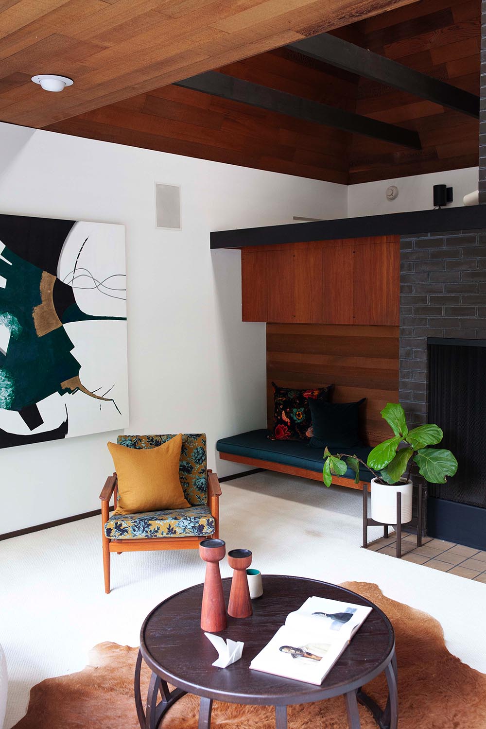

Glorious Gold | 0878

Frozen Stream 0669
The Sugar Dust | 0011 walls are a harmonious backdrop for the rich colors like mustards and teals, found in art fabric and furniture. This vintage chair was updated by Revive Designs, a Portland-based furniture maker and upholsterer Consider complementing warm woods and whites with Glorious Gold | 0878 and Frozen Stream 0669.
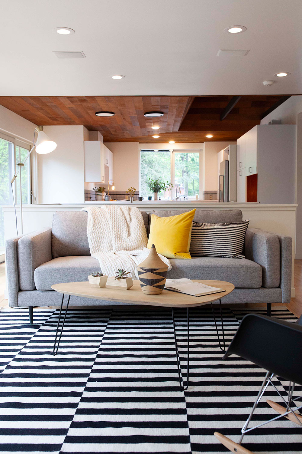

I’m A Local | 0863
Beyond the dining area is a more casual family room that opens to the kitchen. Saul Zaik famously said of his work from this era, “We were really just building boxes with a bunch of windows but experimenting with how you integrated indoor and outdoor spaces.” Read more about Saul Zaik on Portland Architecture blog.
Sugar Dust | 0011 walls throughout complement the original wood paneling and ample outdoor views. Consider a curated color pop in a neutral scheme, like the sunny yellow used here. Find this color in paint by checking out I’m A Local | 0863.

Black Licorice | 0529
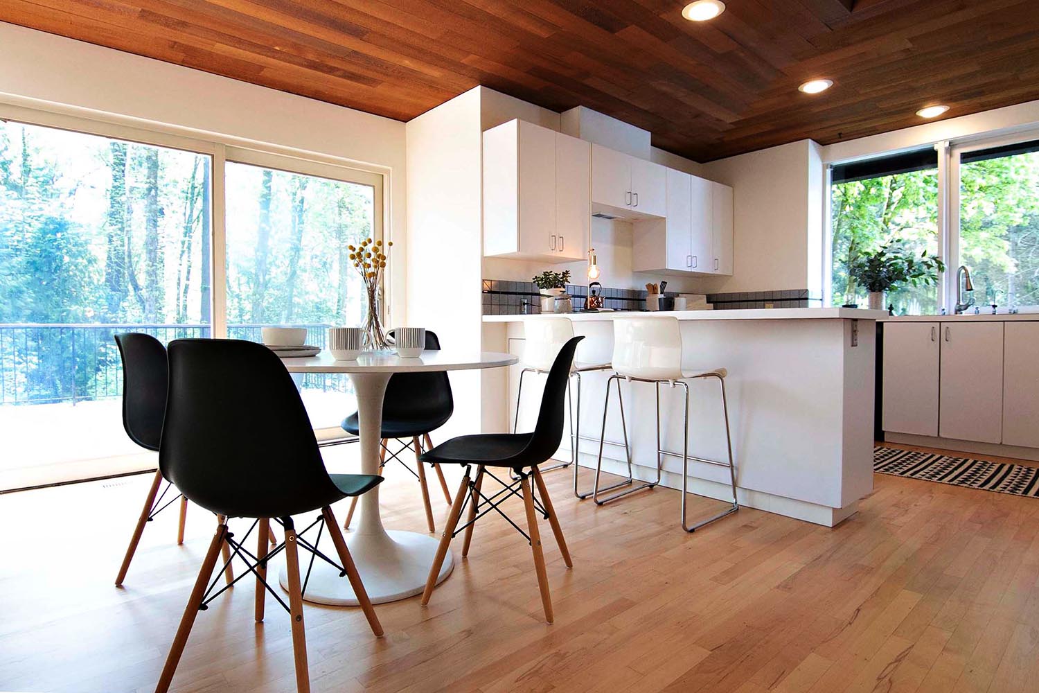
A fresh coat of Sugar Dust | 0011 keeps this modern kitchen looking clean and full of light. The warmth of this hue works beautifully with the home’s original wood paneled ceiling. The addition of black accents adds a clean contrast. Check out Black Licorice | 0529 for a strictly black paint color without undertones of blue or green.

White Shoulders |1265
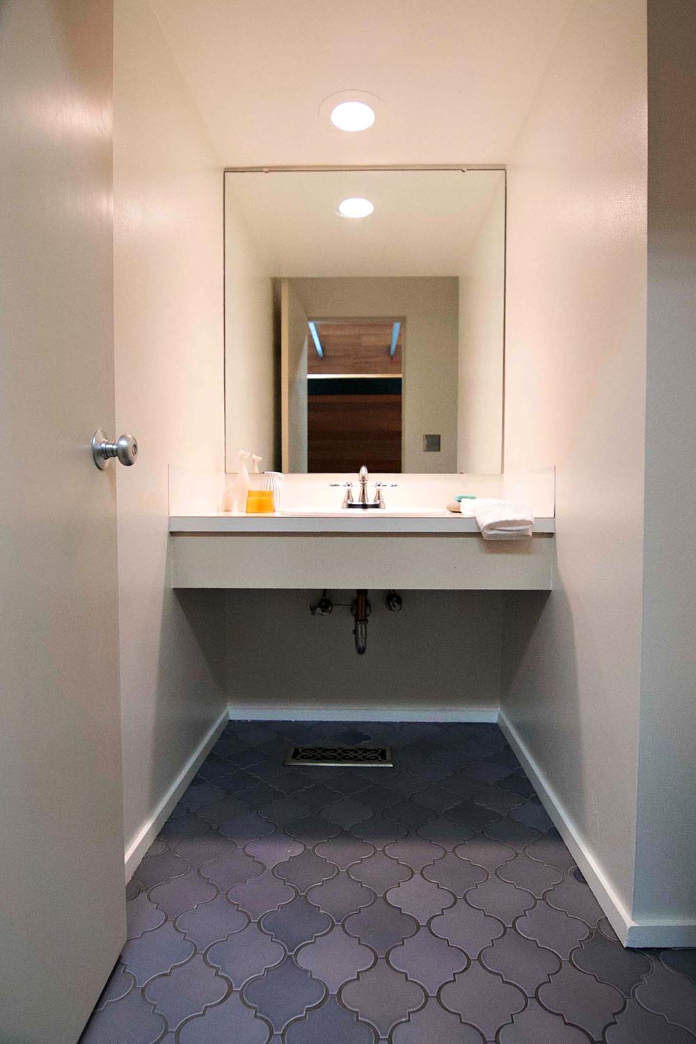
Sugar Dust | 0011 for the win! When prepping a home to sell, neutral hues let the architectural details of a home shine. We love the pairing of warm white walls with these cool blue tiles. Offset walls with brighter White Shoulders |1265 on the trim.

Deep Space | 0487
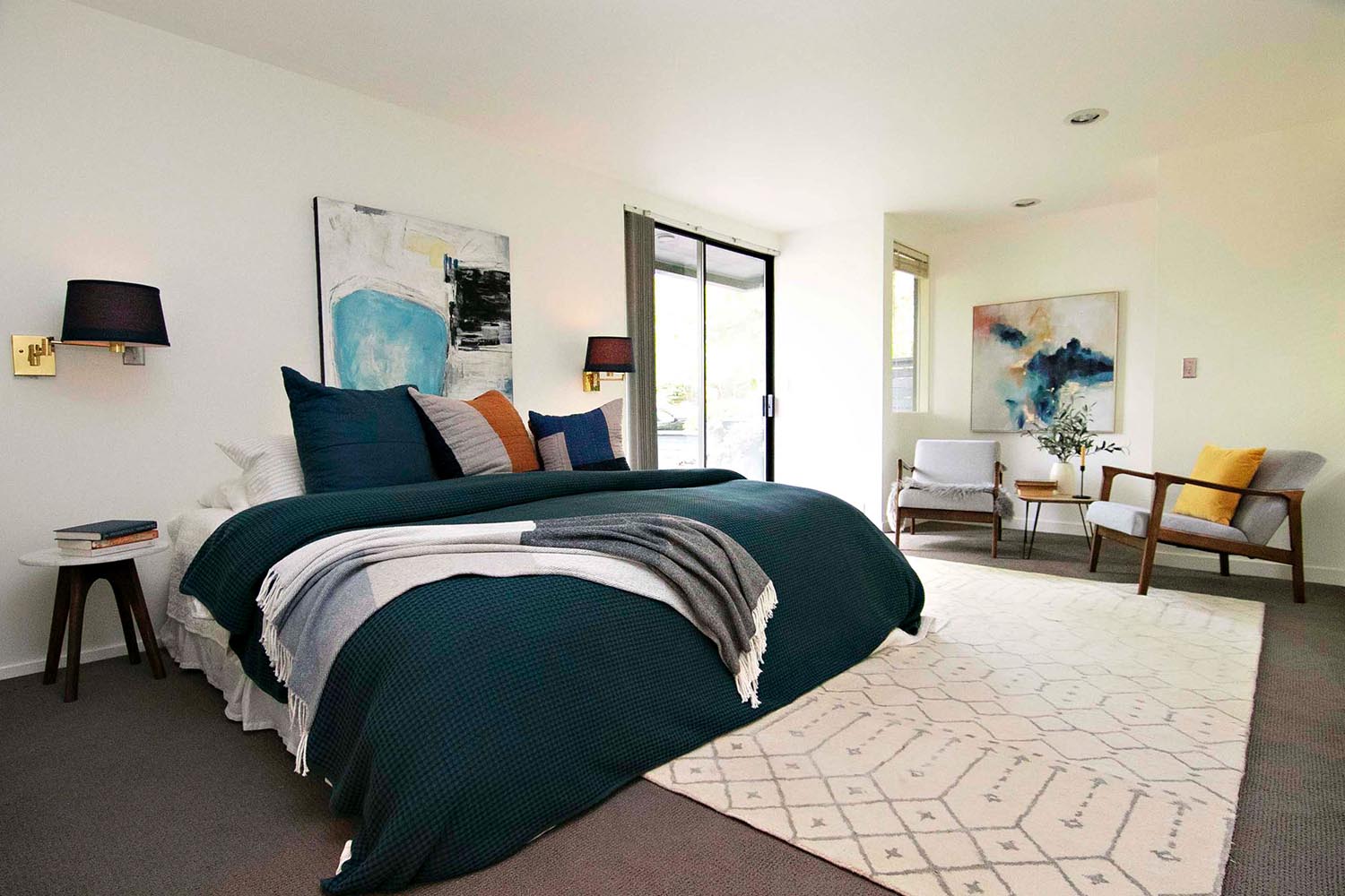
The main level of the home features the primary bedroom, which has a comfortable sitting area that opens up to a private pool. Polka Dot Interiors styled this room with pops of rich color to complement the Sugar Dust | 0011 walls. Loving the dark teal accent? Consider Deep Space | 0487 on furniture or walls!

Blue Depths | 0626
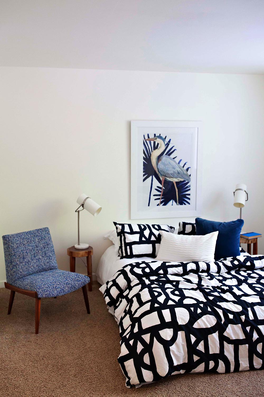
Another bedroom on the lower level with Sugar Dust | 0011 walls and modern styling by Polka Dot Interiors. Blues are no-brainer in a bedroom, as cool hues promotes rest and relation. Blue Depths | 0626 is a go-to medium blue that can be used sparingly or all over, depending on your mood.
