Summer Color Trends 2021
Inspired by the warmth of summer nights and our emergence from the pandemic, our Summer Color Trend hues are rich, complex, and unexpected.
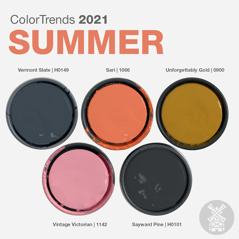
Grounded by sultry darks, this palette is reminiscent of tree silhouettes against a full moon sky. Peeks and pops of melon, earthy gold, and a vibrant pink offset the hazy, heavy hues to infuse outdoor spaces with energy and uplift.
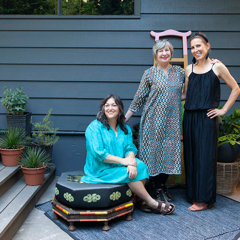
Pictured here: Understory’s co-founders Kate Blairstone and Bridgid Blackburn and Miller Paint’s Director of Color Marketing, Puji Sherer.
Puji Sherer collaborated with Kate Blairstone, Portland designer and co-founder of new outdoor living brand Understory, to create a unique yet versatile color palette that begs to be outside.
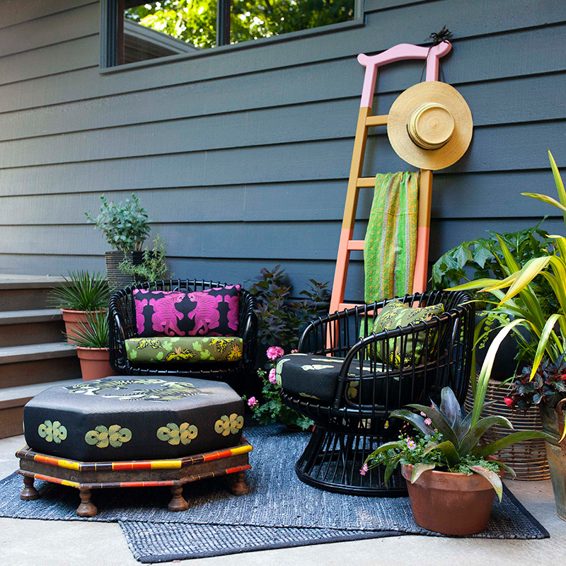
“The darker hues represent contemplation, while vibrant gold and pink represent connection,” says Puji. “As we reflect inward and share outward, we continue to move out of the pandemic and into healing, these colors offer groundedness with a welcoming vibe.” Puji recommends using the darker colors in this palette for exterior siding and trim, with accents of the more saturated colors to highlight architectural detail.
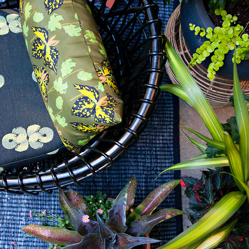
“The Northwest’s plantscape was one of the inspirations behind Understory’s outdoor fabrics. We used the vibrant hues in the fabrics as the foundation of Miller Paint’s summer trends to show how color from nature can be used to create a harmonious palette for your home,” says Kate Blairstone.
Miller Paint’s moody summer color palette includes:
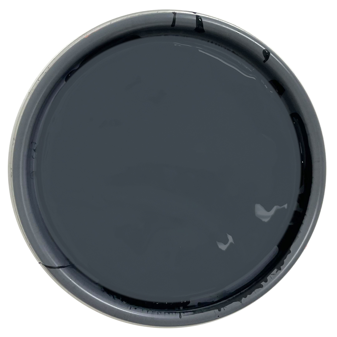
Vermont Slate | H0149 — a mysterious midnight blue. Perfect for exterior siding when black feels like too much.
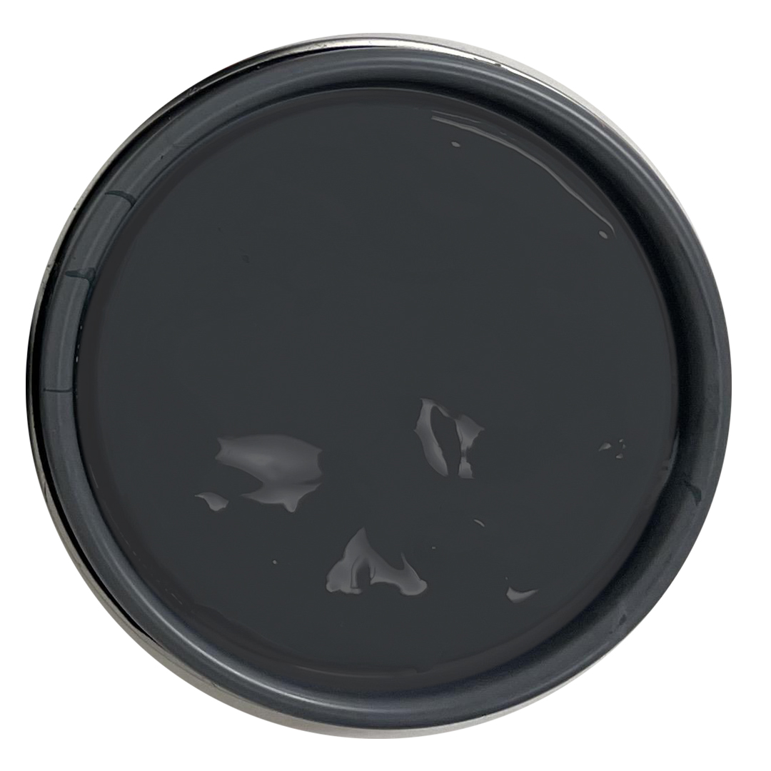
Sayward Pine | H0101 — black with the slightest touch of green. Use on trim, front doors, or a cabin in the woods.
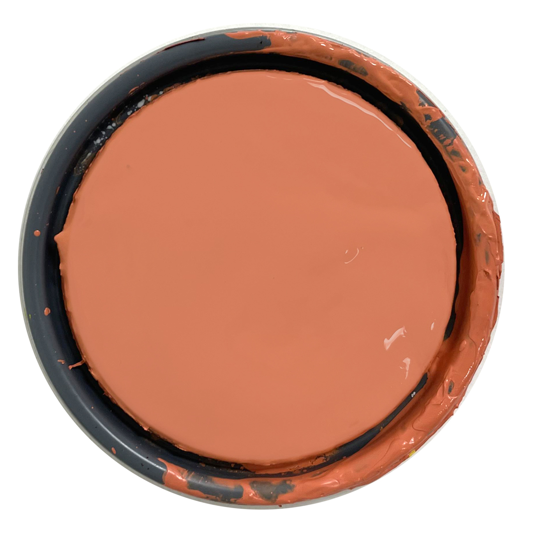
Sari | 1066 — like summer in a color swatch. Part pink, part sunburst, use an accent on doors, sills, and garden boxes.
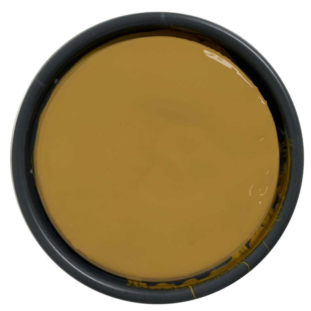
Unforgettably Gold | 0900 - muddy and muted. This natural gold hue shines right up when paired with blacks and blues on brackets, cornices, and fascia.
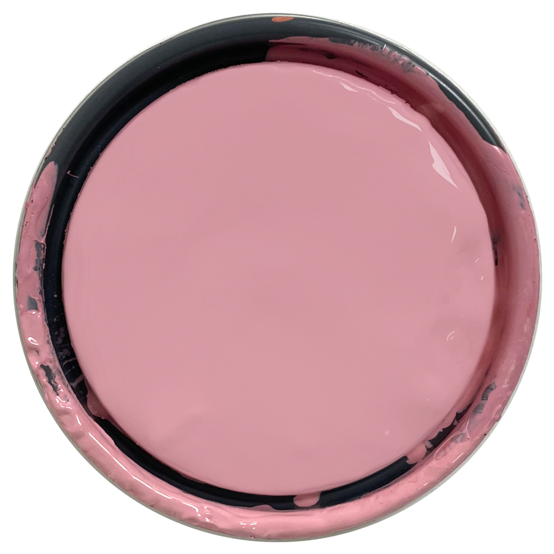
Vintage Victorian | 1142 — a not-so-pure pink with purple undertones. Repaint furniture or a dutch door in this nostalgic hue that feels like NOW.
