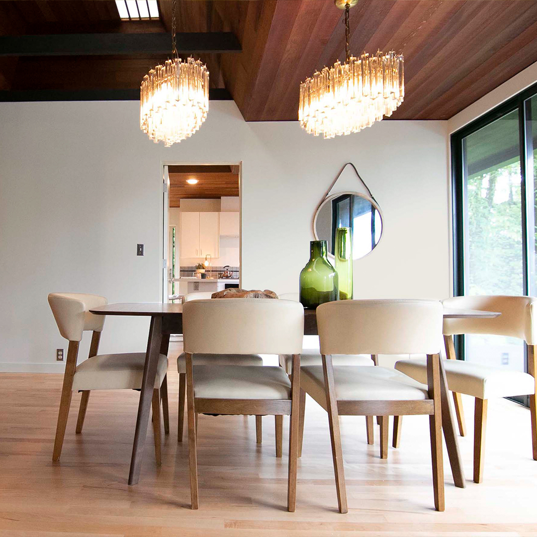
Why Choose Green?
When choosing colors for your home, green often takes a backseat to more popular neutrals or bold hues. However, green is a versatile and transformative color that can bring balance, tranquility, and a touch of nature into your living space.

Why Choose Green?
Green evokes feelings of tranquility, vitality, and harmony. It's the color of nature, and it has been shown to have a positive effect on our mood and well-being.
Psychological benefits: Green has been linked to reduced stress, increased creativity, and improved concentration. It can also create a sense of calm and relaxation, making it a great choice for bedrooms and bathrooms.
Versatility: Green is a versatile color that can adapt to various design aesthetics, from modern to traditional. It can be used as a bold accent color or as a soothing backdrop for other elements in your décor.
Natural connection: By incorporating green into your home, you bring a touch of the outdoors inside, fostering a sense of connection with nature. This can be especially beneficial for those who live in urban areas or have limited access to green spaces.


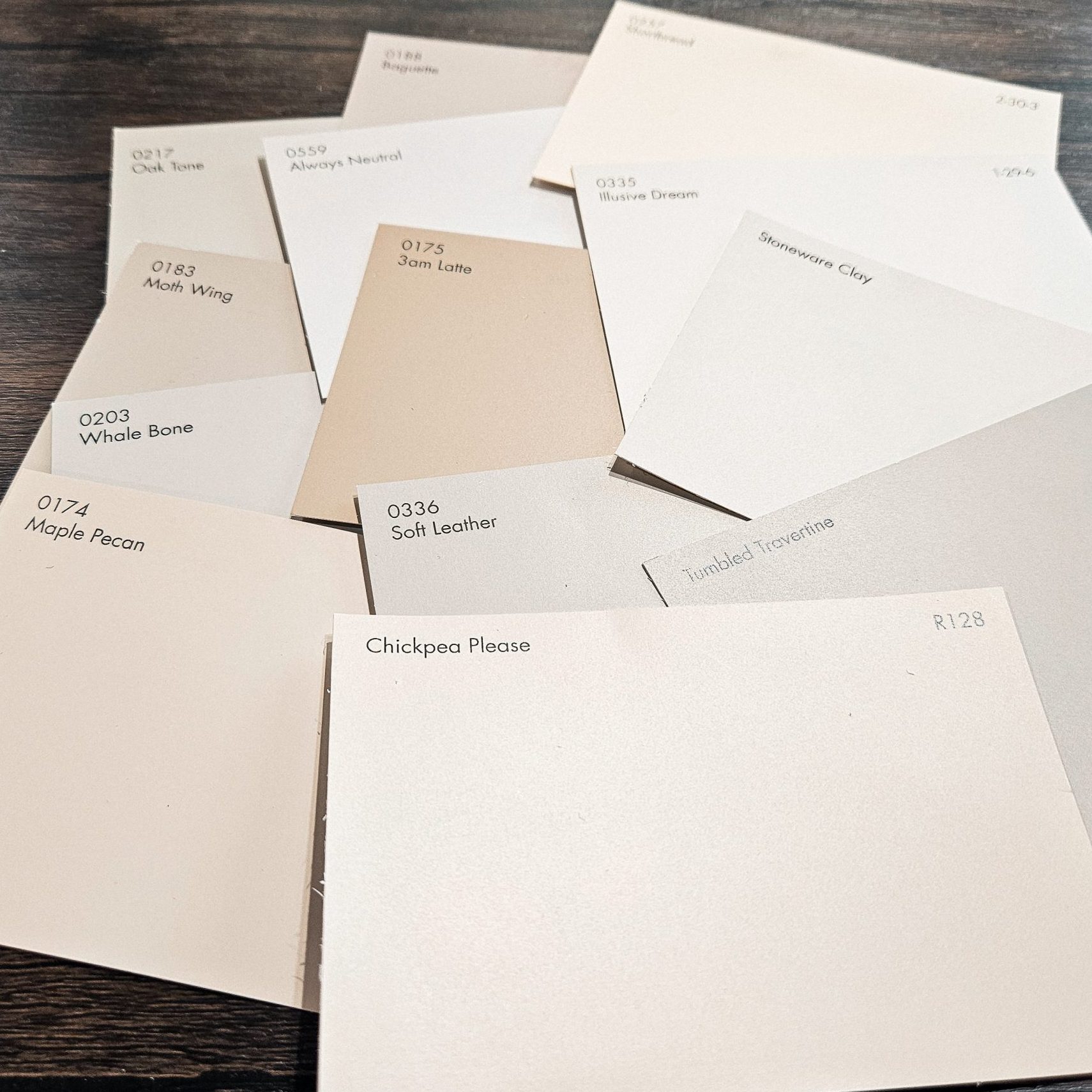
Color of the Month: Mother Nature | 0746
Our featured color of the month, Mother Nature | 0746, encapsulates the essence of green in all its glory. This shade embodies freshness, growth, and vitality. Pair it with accents of Fresh Water | R076, Durum Wheat | R052, Pointe Shoes | R121, or Soft Greige | R006 for a harmonious and inviting aesthetic.
Mother Nature | 0746

Fresh Water | R076

Durum Wheat | R052

Pointe Shoes | R121

Soft Greige | R006


Best Uses of Green
There are endless ways to incorporate green into your home décor. Here are a few ideas to get you started:
- Accent wall: Painting one wall in a bold green shade can instantly transform a room's mood. Choose a wall that naturally draws attention, such as behind a sofa or bed.
- Pop of color for cabinets or furniture: Inject personality into your kitchen or living area by painting cabinets or furniture pieces in shades of green. This adds character and lights up the space.
- Incorporate nature-inspired décor: Enhance your green palette with botanical prints, leafy plants, and wooden accents. This cohesive theme will create a serene atmosphere reminiscent of the outdoors.
Whether you opt for an accent wall, a pop of color in your furniture, or a nature-inspired décor, green is a versatile and beautiful color that can add a touch of serenity and vitality to any home. Embrace the power of green and let it transform your living space into a sanctuary of peace and harmony.
Related Blog Posts
Finding Your Perfect Beige
PAINT THIS: Stripe Border Floor

PAINT THIS: Crisscross Stripe Dresser

COLOR TOUR: Dayton, Oregon’s Historic Brick Hall

Mushroom Pizza Fritta Recipe from Tournant